If you’ve ever opened Twitter and watched a commercial, laughed at a YouTube video, or read an article, you’ve already interacted with Twitter Cards. Cards are a handy and essential function of using Twitter for business and driving traffic to your website.
It’s spooky season, witches.
31 Nights (@31Nights) September 18, 2019
🖤 this tweet to get a reminder to watch #31NightsOfHalloween on Tuesday, October 1 on @FreeformTV. pic.twitter.com/iDdlyWaDUE
In the example above, ABC Freeform, uses a Player Card to get their audience into the Halloween spirit.
Twitter Cards are easy to implement and can revitalize a social strategy with an app almost half its users open every day (that’s roughly 150 million people). Learn how to use them to your benefit, below.
Twitter Cards are media-enriched tweets that stand out to Twitter users, encourage engagement, and ultimately drive traffic back to your landing pages. There are four different types of Cards: Summary, Summary Card With Large Image, App, and Player.
Go into peak hiring season with the tips you need to stand out and find the #job meant for you: https://t.co/EC0OlEJ8ek #InItTogether
LinkedIn (@LinkedIn) September 23, 2019
The different types of Cards note the structure of the tweet. A Summary Card, for example, will include a small photo, a title, and brief summary of the content it’s teasing. Summary Card with Large Image has the same setup, just with a larger image.
App Cards pull the featured image and link of your app from the Play Store or App Store for the tweet. Player Card tweets will automatically play video and link to your website at the bottom of the tweet.
To the Tailgate Titans. The Champions of Cheering. The Halftime Heroes. Welcome back. #ShareaCoke
Coca-Cola (@CocaCola) September 4, 2019
Cards are extremely versatile, like Twitter itself. There are a plethora of ways to use them to optimize your content. If you’re rolling out a new podcast or product update, Cards are a best friend for promoting them on Twitter.
How to Use Twitter Cards
The different types of Cards make it easy to decide how you want to use and promote them. Each Card type has specific requirements that optimize the content you intend to post. For instance, if you wanted to promote a video using Cards, Player Cards are specifically set up for the video to run at its most pristine level.
Summary Cards, for example, are a great way to highlight new blog posts or share articles, introduce a new sale on your products, and promote testimonials on your website.
TC’s Greg Epstein and Kate Clark talk mental health startups and the ‘Cult of the Founder’ https://t.co/b8N7udLLxX
TechCrunch (@TechCrunch) September 27, 2019
This Summary Card by TechCrunch is promoting a recent blog article, using all of the attributions of a Summary Card: thumbnail image, description, and title. And the most important part: a link to TechCrunch’s website, ready to increase that lovely website traffic.
Summary With Large Image Cards are for content with a strong visual element.
On Oct. 4th, @PioneerWorks_, in Brooklyn, opens “You’re at Home,” an exhibition of digital projections, performances, sculptures, and music by Jacolby Satterwhite. https://t.co/PuIYEYWzHI
The New Yorker (@NewYorker) September 27, 2019
These Cards use compelling photos to make a statement on audience timelines. Think of a colorful statistic or that new infographic you want to promote. Here, The New Yorker used their Card to display a large photo of the artist they’re highlighting.
Releasing a new app? There’s a Twitter Card for that too. Let’s see how Google uses the aptly named “App Card” to their advantage:
Buckle up, there’s more ahead. Pre-register for #MarioKartTour on the Play Store: https://t.co/EcKpztcMrT
Google Play (@GooglePlay) September 5, 2019
Think of the traffic you can generate from a potential audience of 330 million. App Cards grab their information directly from the App Store or Google Play, so make sure the app you’re promoting is public before creating the Card.
Player Cards automatically play videos on a loop on timelines and feeds, so users don’t even have to leave the app to interact with rich multimedia, and your content gets views. Player Cards give your brand image a boost of promotion to a vast audience.
2.4 million jobs requiring #STEM education skills are predicted to go unfilled. Verizon Innovative Learning and @Pharrell have teamed up to bring technology, education and opportunity to schools to help make sure today's students are ready to fill those jobs tomorrow.
Verizon (@verizon) September 26, 2019
Verizon used this Player Card — and a partnership with Pharrell — to show their Twitter following how they’re introducing STEM job opportunities in schools. In 30 seconds, Verizon gets their message across in the video, using a celebrity endorsement to grab attention.
First, tell Twitter what type of Card you’re using with meta tag markup to the <head> section of your webpage. The one below is for Summary Cards:
meta name="twitter:card" content="summary"/meta
You can only have one Card per page.
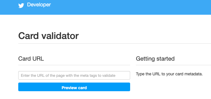
To test your tags, test run the URL through Twitter’s validator tool. Note that if you’re using a Player Card, after this step, you’ll need to request approval for whitelisting. To complete this, a “Request Approval” button will appear on the validator tool.
 Image Source: Twitter Developer
Once you’ve tested in the validator or had your Player Card approved, tweet the URL and you’ll see the Card appear below your Tweet.
Twitter Card Meta Tags
Meta tags appear in a web page’s source code; they are little snippets of text used to describe what’s on a webpage. These meta tags are used to tell search engines what’s on the Cards, which can optimize website traffic for you. Adding the correct tags is important for SEO. These meta tags are used to describe the card type and username of the website. The third is for the Twitter User’s ID and can be interchanged with the second:
twitter:card, twitter:site, twitter:site:id
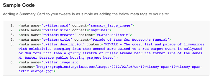
From there, meta tags are a sort of “mix-and-match” deal depending on what you’re using them for. For instance, if you were to implement a Summary Card With Large Image, your code would look like this:

Image Source: Buffer
In this image:
- twitter:creator was used for the @username of the content creator
- twitter:title was used for the title of the content (which has a max of 70 characters)
- twitter:description has a max of 200 characters and describes the content
- content= needs to be in front of the description, and twitter:image is used to tell Twitter the URL of the image
Supported formats are JPG, PNG, WEBP, and GIF. Only the first frame of the GIF will be imported.
With all this talk of maximum optimization, you’re probably wondering what types of photos are best for Twitter Cards. Do they have a specification? I’m glad you asked.
Twitter Card Image Size: For Summary Cards, the image has to be at least 120 x 120 pixels, but cannot exceed 1MB. This is the same for a Summary Card With Large Image, but the smallest photo size is 280 x 150 pixels. App Cards require images to be 800 x 320 pixels, and Player Cards must have level 3.0, dimensions in 640 x 480 pixels, and 30 frames per second.
Social media channels are a reflection of brands. To some of 330 million users on Twitter, your tweets may be the first interaction they have with your company, so a properly optimized image is key to putting your brand’s best foot forward.
Because these dimensions are slightly different for each type of Card, think about the type of content you’re promoting and which Card will be best for that. If your blog post about eCommerce won’t have the best featured image but has a rich description, go with a Summary Card instead of a Summary Card With Large Image.
Twitter will let you preview your Card before you post it in the validator tool, so you can adjust your image to your desired effect. You can also preview Player content in the tool to make sure it runs smoothly, so be sure to check multimedia content before you post.
Twitter Card Examples
1. Summary Twitter Card example
If you scroll down your timeline for about five seconds, you’ll run into a Promoted Twitter Card, which are very handy if you’re looking for fresh ways to use your Twitter Cards. For instance, let’s look at Merriam-Webster (an account worthy of your follow — and yes, they are the “Dictionary People”).
Folks, this was your (quite crowded) week in words.https://t.co/N0oSLlAwPe
Merriam-Webster (@MerriamWebster) September 27, 2019
This is beautiful use of a Summary Card. The title is less than 70 characters, the description is enticing, and the image is larger than 120 x 120. This Summary Card jumps out at you on a timeline and makes you want to read a recap of popular words used in the past seven days.
2. Summary Cards with Large Image example
In honor of #NationalCoffeeDay, WalletHub compared the 100 most populated American cities in terms of coffee-lover friendliness. https://t.co/3D5lVvfAex
HuffPost (@HuffPost) September 29, 2019
The Huffington Post used their Summary Card to give potential readers the featured image of their blog post for National Coffee Day. Because the image is high quality, it pulls audience members in, especially those with a thing for latte art, like myself.
3. App Card example
Did you know World Wrestling Entertainment (WWE) knows their way around an App Card?
.@WWE Champion @TrueKofi selects 5 matches to start with - @Apple @AppStore https://t.co/mI7njYyQcu
WWE Public Relations (@WWEPR) September 25, 2019
To promote their app, WWE used this amazing App Card to highlight champion Kofi’s five must-watch matches, curated by Kofi himself. The stunning graphic is an amazing image to use on Twitter because it stands out on timelines, especially on timelines with darker modes turned on.
4. Player Card example
Cartier is embracing the Player Card with this commercial promoting their new digital series.
#LOdysséedeCartier, the new digital series : dive into the heart of the Maison’s influences and the founders of the Cartier style. Discover more.
Cartier (@Cartier) September 24, 2019
In the fast paced commercial, the team at Cartier uses video clips old and new, but all are optimized with a clear video format. Even the black and white snippets hold up very well.
Twitter Cards jump out at your audience and, lucky for us, they’re easy to use.. Take 15 minutes out of your busy day, and find your next content marketing obsession.
from Marketing https://ift.tt/2n3qaaV
via IFTTT
Comments
Post a Comment